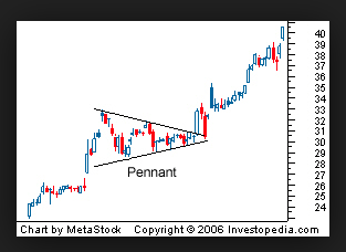
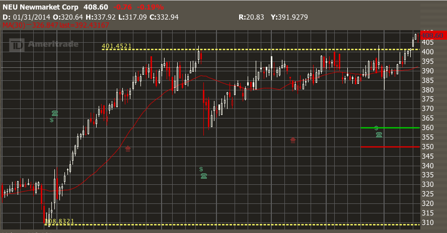
 Do you see a pattern in this chart?
One one hand, the stock hits the same high level several times and backs way. But each time, it retreats less, and we see a "pennant" shape forming on the chart. On the fifth or sixth attempt, the stock finally pierces the ceiling and heads into the sky. This is just one of many stock chart patterns that we can use to trade more intelligently.
But are stock patterns real? Aren't traders just seeing what they want to see? I have to admit, many of the chart ideas I hear of are gimmicky. But if the same pattern is confirmed several times, you have to ask if other traders are seeing it as well. If they see, they will trade it. And so should you. You will be right most of the time, but its not an infallible guide to future price actin (nothing is!).
Here are "five favorite" chart patterns that almost everyone sees, and will help you make better trading choices. Anyone reading these patterns will trade more successfully.
1. Trend. Is the stock going up, down or sideways over time?
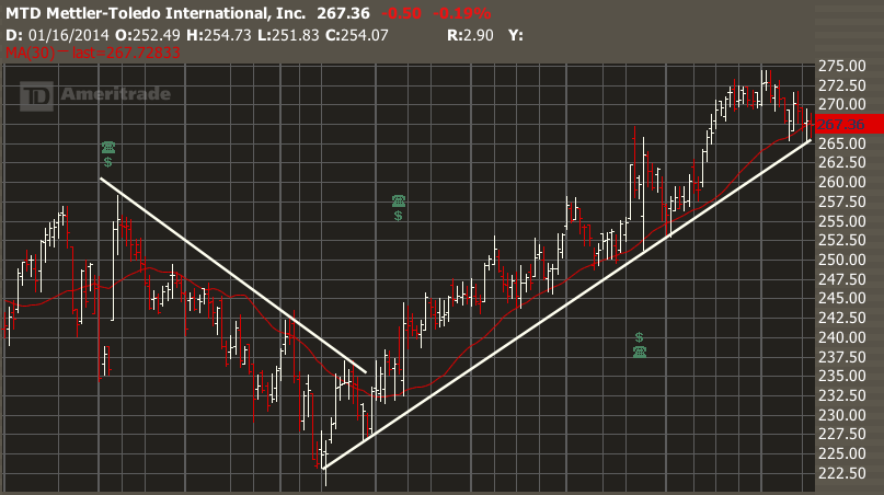
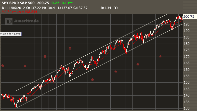
On the charts, we find a trend by placing a simple white line along the bottoms or tops of the price action. The "bullish" or "bearish" trend shows lower lows and highs, and the bullish trend shows higher lows and highs. Traders will often see the tails of price action conforming nicely to these lines.
Here is MTD showing the two trends.
2. Range. What is the width of the stock movement over time?
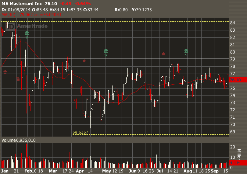
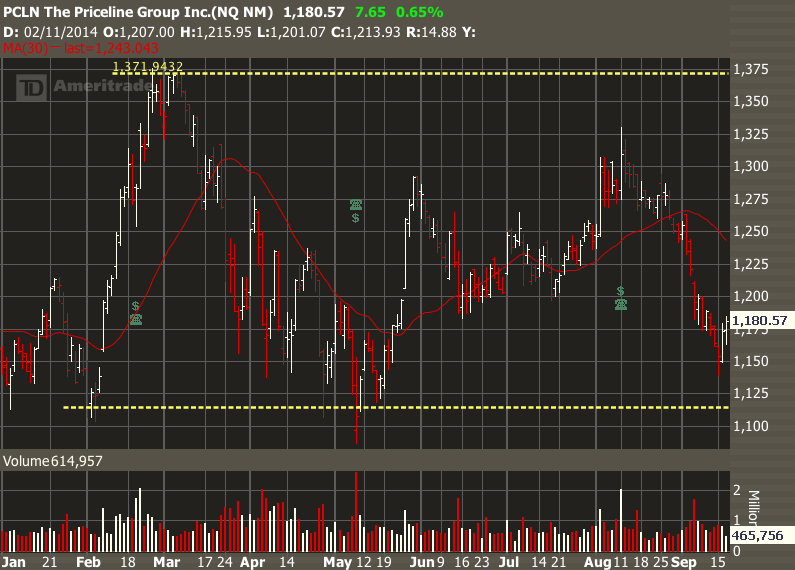
If you can identify the trend, then look for major turning points and identify the range. Range is defined by two major complementary turning points, one up and one down, or one down and one up. We use yellow dotted lines to show the YTD range.
See this chart of MA and its $15 range.
3. Relation to Moving Average. What is the relation of the current stock price to its 30-day moving average?
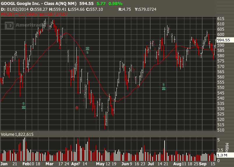
A bullish trend is confirmed when a stock trades above the average for an extended period, a bearish trend when it trades below, and a sideways trend when it crawls horizontally along the average.
Here on this stock of GOOGL we see the stock trading above the red MA(30), then below, then above again, and then alternating either side in sideways motion. Not all stock charts are this clear, but this one is easy to trade.
4. Gaps. Are there places where there is just a hole in the chart?
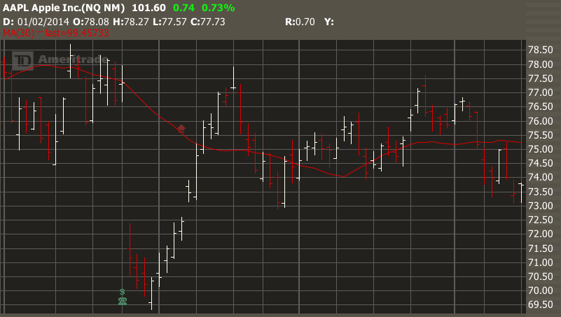
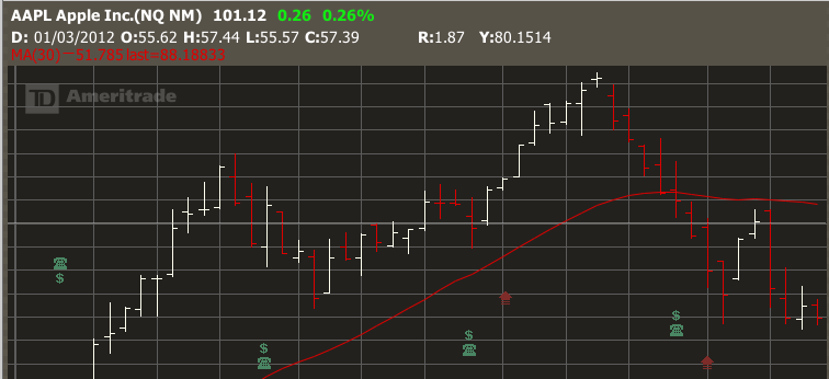
This will often follow a major news announcement or earnings report, and can go up or down. These are very useful to options traders as they tell us that buyers and sellers have quickly reset their price expectations. Some stocks later try to "fill" that gap, others don't.
Look at this exemplary AAPL chart , as the stock sells off by 10% in one day on an earnings announcement, and then rallies back over three weeks to "fill the gap".
5. Channels. Is my stock going up and down within a tight range?
When stock oscillates over weeks or months, we can often identify a channel with defined edges. Look for confirmation signals such as smaller gaps and increase in volume which confirm that the stock is conforming to the channel pattern.
Here is SPY, which has been trading in a channel for over 2 years! A sure sign that the American economy is slowly and surely improving.
PCLN's chart year-to-date shows the stock trading in a range between 1100 and 1375. The stock appears to be trading sideways in a 20% channel. Can you identify two or three small gaps in the chart which confirmed the channel?
And here's one more for good luck...the pennant pattern that we started this post with.
6. Pennant or Flag.
Sometimes we can safely predict that a stock is going to break out higher or lower when we see an increasing narrower range--producing a pennant shape. Stock will break out as the pennant narrows. The direction will often follow the larger trend, or more commonly the direction of the steeper slope of the pennant shape.
Q & A
Finally, answers to some questions from a recent "Introduction to Reading Charts" seminar.
Q. Doesn't the share or stock price have to start off each new day at the place it left off the day before?
A. No, not at all. It often happens, but there is no rule about this. Just look at the charts and see how often it happens--not very often.
Q. You talked about "doji" and other Japanese candlesticks. But they are not easy to find on the chart.
A. The "doji" indicates a day of indecision about a stock's direction, when buyers and sellers are balanced in their price expectations. But they also often occur where there is no change of direction, and simply represent a pause in the trend. In my view, they are most telling at the extremes of a range. In class I showed one outstanding example for AAPL exactly two years ago (Sep 17, 2012). The stock dropped 42% after this "evening star doji".
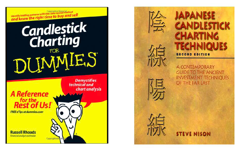
We will have a whole class on candlesticks in the future, and so in the meanwhile, I can refer you to these two books.
Q. What indicators do you use? I don't hear you talking much about them.
A. Not many. The most useful are the 30MA (30-day moving average) and the 10MA (10-day moving average). Options traders are usually trend traders, which means that we don't need many indicators, as the trends are pretty obvious on the chart. I rarely consult these technical indicators, but sometimes I'll use a RSI (relative strength index) which uses direction and volume, to confirm something the charts are telling me. However, some people use them a lot and I'm glad they get benefit from them. There are people in our HOT group like Jim who know much more about indicators and they can help you.
Tiger says: “If you don’t know where you are going, you’ll end up someplace else.” Actually it was Yogi Berra, who also said, "Nobody goes there anymore. Its too crowded."
========================
Tiger teaches options trading at Honolulu Options Traders, in Hawaii.
For more info, go to facebook.com/honoluluoptionstraders and meetup.com/honolulu-options-traders
Copyright © 2014 Honolulu Options Traders, LLC,
All rights reserved worldwide.
