 Since ancient times, mariners, architects and many others have used charts to preserve information useful for the future. If you go to a hospital, your medical information will be held in a chart-- your temperature, heart rate, pills, even things you mutter in your sleep!
 Nurses and doctors enter information electronically onto digital charts and use them to track your progress over time, analyze for patterns, and protect themselves against law suits.
Similarly, stock charts give traders important information about the history and behavior of a stock. By revealing price movement, earnings announcements and volume, charts provide useable data. Traders can examine price ranges and pattern formations when deciding which strategies to use.
No one can say for sure whether the stock market will be up or down tomorrow, next week or next year. But we do have the past, and from there we can calculate the probability of a future event occurring. The past or price action of any stock is encoded in the stock charts that all traders consult. Charts can be configured to show prices by the minute, hour day, week, month etc. and as far back as the stock has existed. We use minimal technical analysis to read and understand what past price action might mean for future trends.
The charts are more important to options traders than any news, because we cannot tell what a news item means until we see how the price reacts. Any price change is recorded first on the charts, and that influences how we trade it. Reading charts is the major part of technical analysis of a stock (as opposed to fundamental analysis), which includes price, volume action and the interpretation of patterns. (The differences between technical and fundamental analysis are described here.)
ACTION: Open your TOS and select Charts/Prophet, the charting software we most often consult. Type in SPY and select the one-year display.
1. Charts reveal the personality of a stock.
No two stocks are the same. Each has distinct personality traits, just like a human being. Here are 10 questions I usually ask:
- How old is the stock?
- Is it popular (how many shares trade each day)?
- Does it announce earnings regularly?
- Does it gap up or down, or move in a continuous flow?
- Does it shadow other stocks or indexes such as S&P 500 ? (Beta)
- Does it follow seasonal cycles, or move predictably?
- How much does it move each week, month or year?
- How much does it move in response to earnings announcements?
- Are there clearly defined levels of support or resistance?
- Are the options for that stock of sufficient volume?
I hope its clear that by "personality" we are NOT talking about the fundamentals of a stock, but the information revealed in the trading history of a stock, or its technicals. So price charts, volume numbers and advance/decline lines reveal the personality of a stock.
One of the key features is the regular behavior of a stock. If the charts reveal a consistent pattern, then it is usually a good candidate for options trading.
ACTION: Compare the one-year chart for SPY and for your favorite stock. How well do you know its personality? Use the questions above to get to know it a little better. Comparing it to the SPY will give you some clues.
2. Charts allow traders to identify patterns and create long term reference lines.
Prices do not appear randomly on charts. Over time they arrange themselves in identifiable figures such as peaks, trending lines and periods of consolidation. Traders frequently draw lines on charts to show
- highs and lows over the period
- trading channels
- support and resistance
- flags, pennants, cup and handle, etc
These lines not only help traders choose strategies but also select entry and exit points.
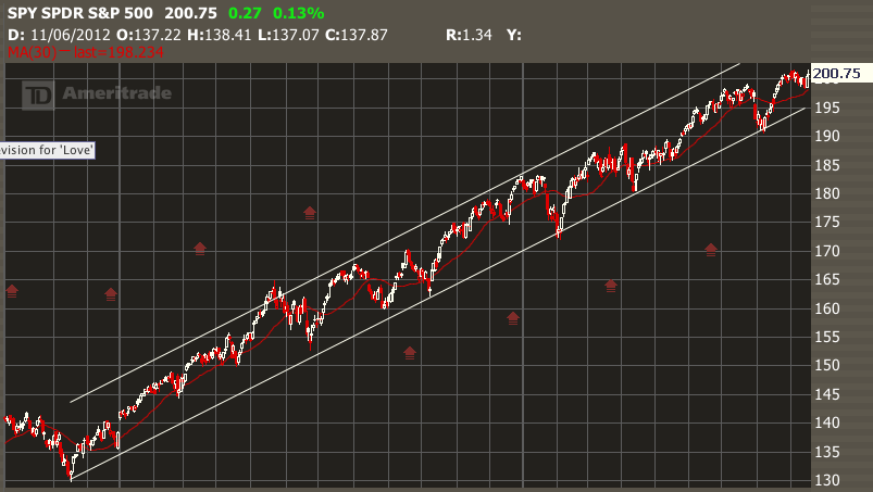
EXAMPLE: On this chart, you will see a "channel" (white lines), which sets up for "swing trading". If you buy Calls (or sell Puts) when the stock is near the bottom of the channel, and then buy Puts (or sell Calls) when it is near the top, you have a successful strategy.
3. Charts suggest patterns traders can use to make smart strategy choices.
The best rule is, let the charts suggest the right strategy. Stocks which are in a long-term uptrend attract Bull Put Spreads. Those that trade in a tight range can be candidates for Butterfly Spreads or short Straddles. Swing traders can use alternating strategies such as Long Puts and Long Calls to trade a "channel". If a stock "fills the gap" then choose the trade which best allows for that, and close the trade once the gap is filled. If options premiums balloon on a stock before earnings, traders can find ways to sell that premium and collect profit from the "volatility crush". Regular income can be generated by selling far out-of-the money puts and calls once a stock's range is established.
ACTION: Compare personality traits of the one-year chart for SPY and for a pharmaceutical stock such as BIIB.
4. Charts guide traders toward greater profits.
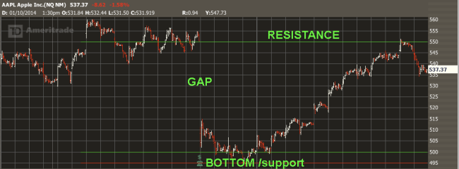
Once strategies are in place, charts can offer points of maximum profitability. This chart of AAPL provided a target of $550 to fill a gap because 550 represented significant resistance. In early 2014, the stock rose from $505 to 550 and we profitably closed out our position. Then the stock fell as resistance overtook momentum. The chart gave us our entry and exit numbers.
But are stock patterns real?
Aren't traders just seeing what they want to see? I have to admit, many of the chart ideas I hear of are gimmicky. But if the same pattern is confirmed several times, you have to ask if other traders are seeing it as well. If they see, they will trade it. And so should you. You will be right most of the time, but its not an infallible guide to future price action (nothing is!).Even if these patterns are only imagined, we must remember that tens of thousands of traders are also looking at these charts, and "seeing" what we see. Research shows that they will "obey" perceived patterns at least 75% of the time!
Seven Features of Charts that Will Make You Money
Here are some favorite chart patterns that almost everyone sees, and will help you make better trading choices. Anyone reading these patterns will trade more successfully.
1. Range. What is the width of the stock movement over time?
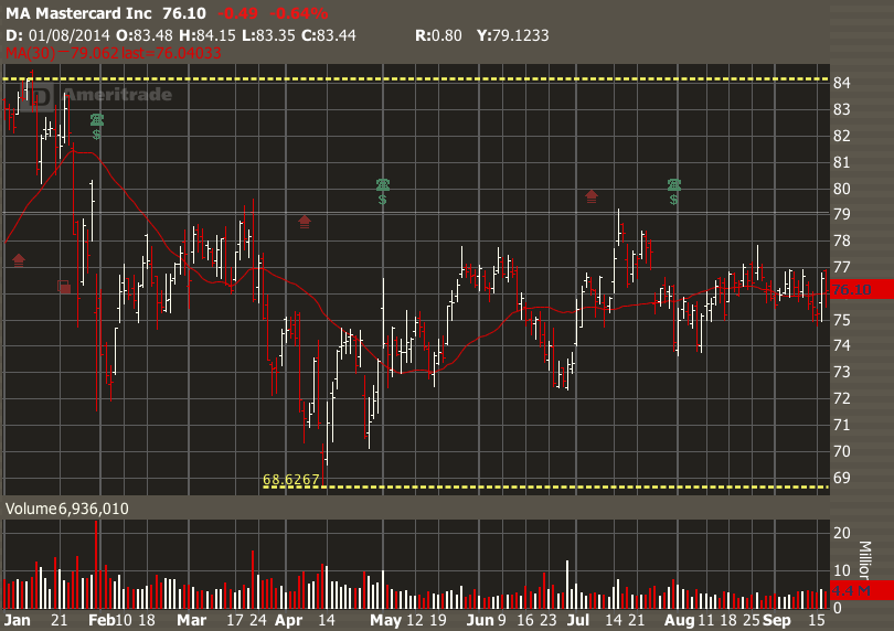
The first thing to notice about a stock chart is the price range. Range is defined by the highest and lowest price on the one-year chart. You will often find two major turning points, one up and one down, or one down and one up. We use yellow dotted lines to show the YTD or one-year ange. Here is a YTD chart for MA, showing the stock in prolonged sideways channel.
ACTION: Select any five yearly charts from the price range (you will be using them several times for this lesson.), including SPY or $SPY. Identify the range on each. What is the amount of the range in $$$ ? What percentage is that of the price? Is there anything else you noticed about the range?
2. Trend. Is the stock going up, down or sideways over time?
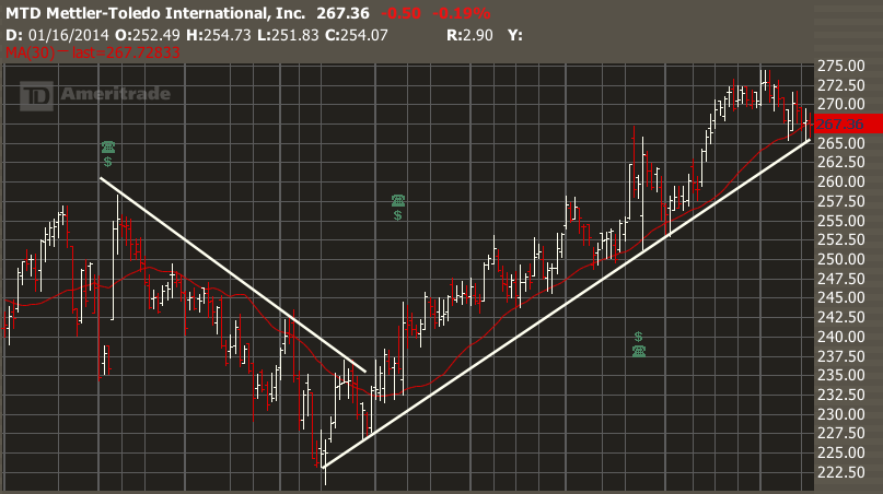
Within the range, you will find major turning points. Each one signals a change in the stock's trend. We find a trend by placing a simple white line along the bottoms or tops of the price action. The "bullish" or "bearish" trend shows lower lows and lower highs, and the bullish trend shows higher lows and highs. Traders will often see the tails of price action conforming nicely to these lines. Is the stock trending up, down or sideways? In ending a trend, does it bottom out like a Hawaiian beach, or like an Arctic precipice?
Here is MTD showing two trends. The new trend is starting just as the price moves above the downward line.
ACTION Identify the trends in the one-year charts of SPY and any other stocks you have chosen. Try to add lines to the charts, as in the example given. How many changes of trend were there over a year on each chart? Is it easy to identify a change of trend?
3. Relation to Moving Average.
First, make sure that "Moving Average--Simple" is selected in your "Technical Studies". It will be a red line on your price charts. What is the relation of the stock price to its 30-day moving average?
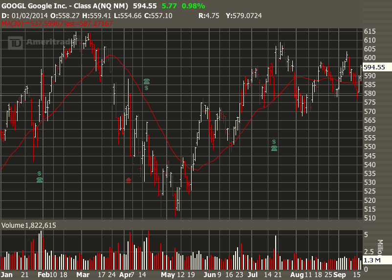
The Moving Average is one of the commonest indicators used on charts. A bullish trend is confirmed when a stock trades above the average for an extended period, a bearish trend when it trades below, and a sideways trend when it crawls horizontally along the average.
Here on this stock of GOOGL we see the stock trading above the red MA(30), then below, then above again, and then alternating either side in sideways motion. Not all stock charts are this clear, but this one is easy to trade.
ACTION: Add the Moving Average on your TOS "Prophet" charts and view your five charts again. Does the chart confirm that trend by a change in the direction of the moving average?
4. Gaps. Are there places where there is just a hole in the chart?
Take a look at your elected charts and see if you see any significant gaps. Does the chart have many gaps, and do the gaps subsequently fill? You will most often find them associated with 1) changes in trend, and 2) earnings report or major news announcement, and can go up or down. These are very useful to options traders as they tell us that buyers and sellers have quickly reset their price expectations.
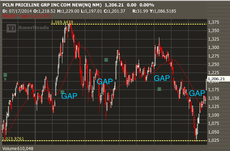
Confirming gaps. Gaps are one of the most reliable indications that a stock has changed direction. A new down trend or uptrend will be confirmed by a no-going-back commitment by traders. Look at this chart from PCLN and you will see several confirming gaps. This is especially convincing if the gap jumps the Moving Average line. Here are several confirming gaps on a chart for PCLN.
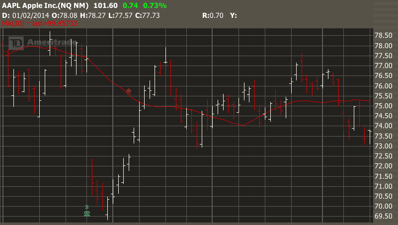
Filling the gap. Some stocks return to "fill the gap" and others don't. Look at this exemplary AAPL chart , as the stock sells off by 10% in one day on an earnings announcement, and then rallies back over three weeks to "fill the gap" before drifting sideways.
ACTION: Find any gaps in your charts. If you don't find any, go to some other charts and look for them [ e.g. AMZN]. Not all charts have gaps, but some have them consistently. Does it predict the direction of the stock? Interpret them--does the stock "fill the gap"? [There is a "Show Gaps" tool in Charts/Prophet/DrawingTools.]
5. Channels. Is my stock going up and down within a tight range?
When stock oscillates over weeks or months, we can often identify a channel with defined edges. Look for confirmation signals such as smaller gaps and increase in volume which confirm that the stock is conforming to the channel pattern.
Here is SPY, which had been trading in a channel for over 2 years! A sure sign that the American economy is slowly and surely improving.
ACTION: Can you find any channels on your charts? Look for them and identify how they begin or end. How does SPY look now? Is it still in the channel?
6. Support and Resistance
At any time, there are prices above which buyers are not willing to buy, and below which sellers are not willing to sell. Often prices will return to these levels several times before bouncing off them. When the bounce is up, we consider support, when the bounce is down, we term it resistance. Here is a recent AMZN chart showing support around the 475 level tested twice [click to enlarge]. The yellow lines clearly show that around the 475 lev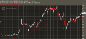 el, sellers of AMZN simply dried up, forming a strong base of support. Similarly, investors at this time were not willing to spend over $700 for AMZN.
7. Reversals
Building on No.6, we often see stocks change direction at points of resistance or support. This is especially true of momentum stocks such as PCLN. Look at the dramatic turns in the AMZN chart above. Alert traders will be ready and anticipate such movements.
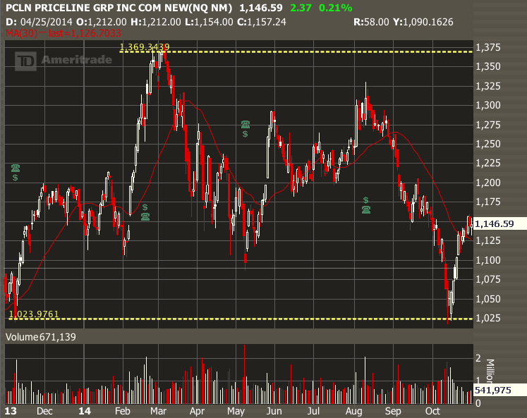
Here is a recent example from PCLN.
Over a one year period, PCLN ranged upward then downward by 35%, but nothing in the fundamentals justified this range of prices. Rather than explain this behavior by fundamentals, it is better to say that PCLN's price is a rotating or channelling stock, alternately driven by bulls and bears. Investors simply support the stock, then take profits, then sell it. In October 2014, they drove the stock all the way back down to about $1020 (same price as Oct 2013), then vigorously bought it again. In 2015 they did similar things, but looking at charts helped provide exit and entry points. These reversals are dramatic and fairly easy to trade, even though the stock is expensive, and occur several times a year.
Other Chart Patterns
Traders also use many common chart patters such as pennants, flags, cup or bowl, V- and U- shaped valleys, bouncing ball and many others. We will leave them for another time!
What about the fundamentals of a stock?
Although basic information or "fundamentals" of a stock are important, the charts show the price action of a stock. Traders have to deal with actual prices, not other information such as P/E rations, market share, or gross revenues. A stock may be "overbought" or "oversold" according to market pundits, but again, it is the price that matters. Only the charts tell the truth, as it is price action and nothing else that determines profit and loss for a position. A positive earnings announcement means nothing unless it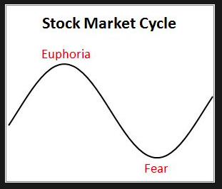 produces a change in price--and there is no way to predict what that will be. In addition, thousands of traders are looking at the charts and making decisions based on what they see. You should do the same!
HOT advice: Learn as much as you can about at least one stock. Understand its market and it's behavior. But remember we are not buy-and-hold traders. Instead, use this information to interpret the charts and make wise decisions about strategy. Use technical analysis to determine the timing of your trades.
HOMEWORK
Time needed: 1.5 hours.
1. Complete the ACTION sections of this post above (in green). Bring your list of charts to the class--or ones you think others have not seen. Make copies if you wish.
2. Once you have thinkorswim set up, use the chat function to ask TDA any questions about how to make drawings on the charts.
3. Where do you think the market is on the Fear/Euphoria scale right now?
See you in class!
Copyright © 2014-2018 Honolulu Options Traders, LLC.
All rights reserved worldwide.

