No one can say for sure whether the stock market will be up or down tomorrow, next week or next year. But we do have the past, and from there we can calculate the probability of a future event occurring. The past or price action of any stock is encoded in the stock charts that all traders consult. Charts can be configured to show prices by the minute, hour day, week, month etc. and as far back as the stock has existed. We use minimal technical analysis to read and understand what past price action might mean for future trends.
In this class we ask two relevant questions, "How do traders use charts to guess future probability?" and "What essential features of price action do we rely on in the HOT Trading System?"
What about fundamentals?
Although basic information or "fundamentals" of a stock are important, the charts show the price action of a stock. Traders have to deal with actual prices, not other information such as P/E rations, market share, or gross revenues. A stock may be "overbought" or "oversold" according to market pundits, but again, it is the price that matters. Only the charts tell the truth, as it is price action and nothing else that determines profit and loss for a position. In addition, thousands of traders are looking at the charts and making decisions based on what they see. You should do the same.
HOT advice: Learn as much as you can about a stock. Understand its market and it's behavior. But remember we are not buy-and-hold traders. Instead, use this information to interpret the charts and make wise decisions about strategy. Use technical analysis to determine the timing of your trades.
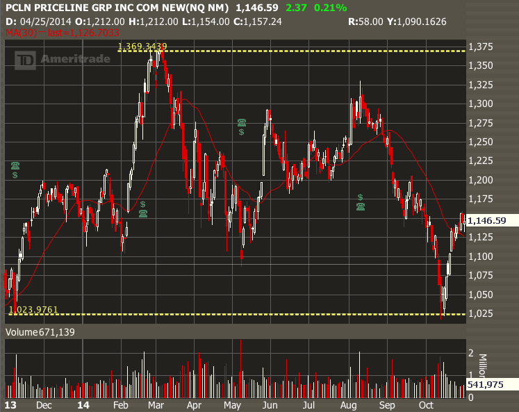
Here is a recent example from PCLN.
Over a one year period, PCLN ranged upward then downward by 35%, but nothing in the fundamentals justified this range of prices. Rather than explain this behavior by fundamentals, it is better to say that PCLN's price is alternately driven by bulls and bears. Investors simply support the stock, then take profits, then sell it. In October 2014, they drove the stock all the way back down to about $1020 (same price as Oct 2013), then vigorously bought it again. Looking at charts helped provide exit and entry points.
Read more about the "personality" of stocks and how to trade them here.
Five Features of Charts that Will Make You Money
But are stock patterns real? Aren't traders just seeing what they want to see? I have to admit, many of the chart ideas I hear of are gimmicky. But if the same pattern is confirmed several times, you have to ask if other traders are seeing it as well. If they see, they will trade it. And so should you. You will be right most of the time, but its not an infallible guide to future price actin (nothing is!).
Here are some favorite chart patterns that almost everyone sees, and will help you make better trading choices. Anyone reading these patterns will trade more successfully.
1. Range. What is the width of the stock movement over time?
The first thing to notice about a stock chart is the price range. Range is defined by the highest and lowest price on the one-year chart. You will often find two major turning points, one up and one down, or one down and one up. We use yellow dotted lines to show the YTD range. Here is the YTD chart for MA.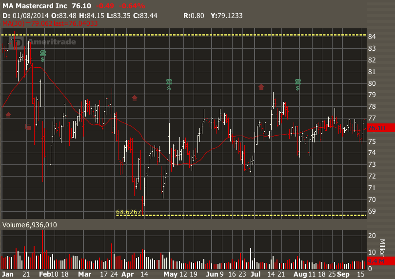
ACTION: Select any half a dozen yearly charts (you will be using them several times for this lesson.) Identify the range on each. What is the amount of the range in $$$ ? What percentage is that of the price? Is there anything else you noticed about the range? Has the range on MA changed recently?
2. Trend. Is the stock going up, down or sideways over time?
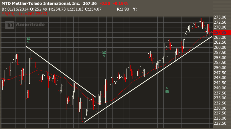
Within the range, you will find major turning points. Each one signals a change in the stock's trend. We find a trend by placing a simple white line along the bottoms or tops of the price action. The "bullish" or "bearish" trend shows lower lows and lower highs, and the bullish trend shows higher lows and highs. Traders will often see the tails of price action conforming nicely to these lines.
Here is MTD showing two trends.
ACTION: Identify the trends in the charts you have chosen. How many changes of trend were there over a year? Is it easy to identify a change of trend?
3. Relation to Moving Average. What is the relation of the stock price to its 30-day moving average? First, make sure that "Moving Average--Simple" is selected in your "Technical Studies". It will be a red line on your price chart.
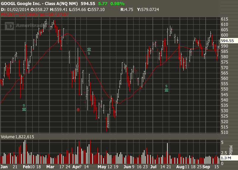
The Moving Average is one of the commonest indicators used on charts. A bullish trend is confirmed when a stock trades above the average for an extended period, a bearish trend when it trades below, and a sideways trend when it crawls horizontally along the average.
Here on this stock of GOOGL we see the stock trading above the red MA(30), then below, then above again, and then alternating either side in sideways motion. Not all stock charts are this clear, but this one is easy to trade.
ACTION: Add the Moving Average on your TOS "Prophet" charts and view your half dozen charts again. Does the chart confirm that trend by a change in the direction of the moving average?
4. Gaps. Are there places where there is just a hole in the chart?
Take a look at your elected charts and see if you see any significant gaps. You will most often find them associated with 1) changes in trend, and 2) earnings report or major news announcement, and can go up or down. These are very useful to options traders as they tell us that buyers and sellers have quickly reset their price expectations.
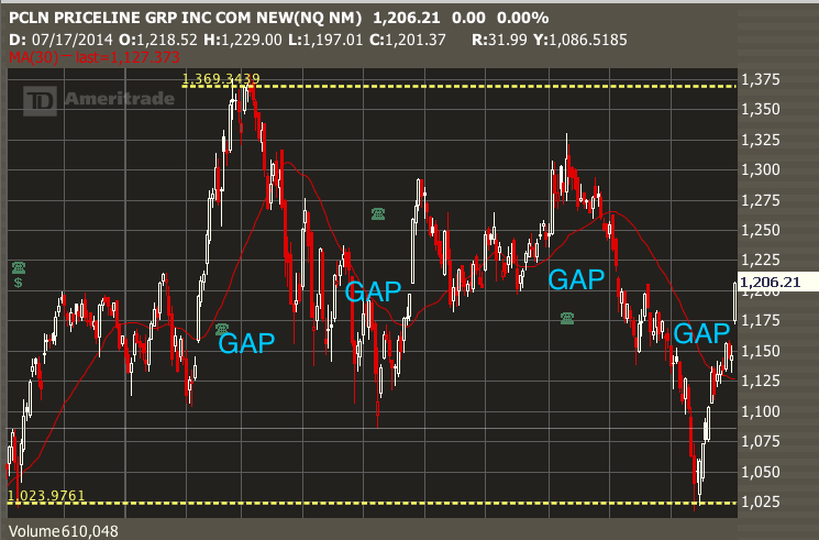
Confirming gaps. Gaps are one of the most reliable indications that a stock has changed direction. A new down trend or uptrend will be confirmed by a no-going-back commitment by traders. Look at this chart from PCLN and you will see several confirming gaps. This is especially convincing if the gap jumps the Moving Average line. Here are several confirming gaps on a chart for PCLN.
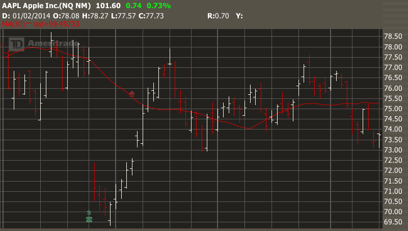
Filling the gap. Some stocks return to "fill the gap" and others don't. Look at this exemplary AAPL chart , as the stock sells off by 10% in one day on an earnings announcement, and then rallies back over three weeks to "fill the gap" before drifting lower again.
ACTION: Find the gaps in your charts and interpret them. If you don't find any, go to some other charts and look for them.
5. Channels. Is my stock going up and down within a tight range?
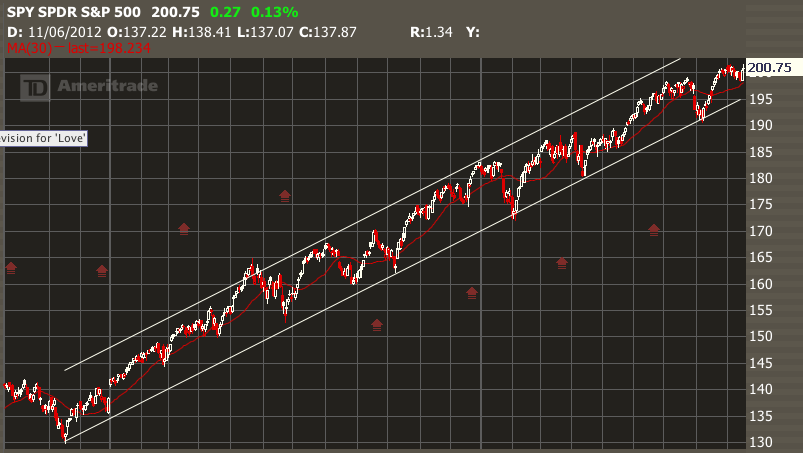
When stock oscillates over weeks or months, we can often identify a channel with defined edges. Look for confirmation signals such as smaller gaps and increase in volume which confirm that the stock is conforming to the channel pattern.
Here is SPY, which has been trading in a channel for over 2 years! A sure sign that the American economy is slowly and surely improving.
ACTION: Can you find any channels on your charts? Look for them and identify how they begin or end.
===========================
HOMEWORK: The ACTION sections of this post indicate your homework.
========================
Copyright © 2014 Graeme Sharrock and Honolulu Options Traders, LLC,
All rights reserved worldwide.
 No one can tell the future.